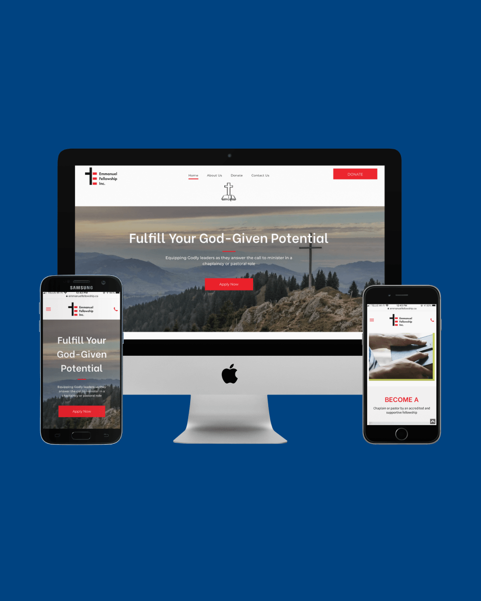
Rock of Peace Counselling Website Design
Digital Consultants allowed people find counselling through Rock of Peace and her book by establishing a professional online presence and an effective website
Problem with Previous Website Designs
X Two Separate Websites
With one website for the counselling services and one for the book, visitors were not able to see the connection between the two and how they went together.
X Vague Call to Action
The website did not make it clear what steps the user should or could take
X Overwhelming Text
There was too much text for users to read. The amount of text took away from the main message
Our Personalized Solution
✔︎ Simple Message
The book and the counselling service were tied together with a seamless user experience into one website which encompassed the whole brand.
✔︎ Clear Call to Action
The website prompts users to "Call Now" to start their journey to peace
✔︎ Simple Message
The value of Rock of Peace Counselling is communicated in simple language so that it is easy to understand
Receive FREE tips to help grow your business online
Meet with our marketing specialists to ignite your online presence today


